*see part 1 here* *see part 3 here*
I began with a preliminary drawing on the canvas. You can use a number of mediums for this including charcoal, pencil, or paint, of course. I used pencil here. At this point I take the time to focus on accurate drawing, through careful observation of the subject, paying more detailed attention to the face, hands, and feet.


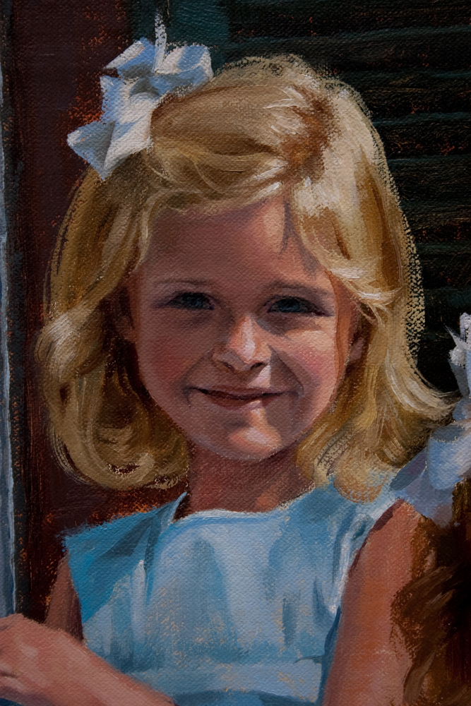
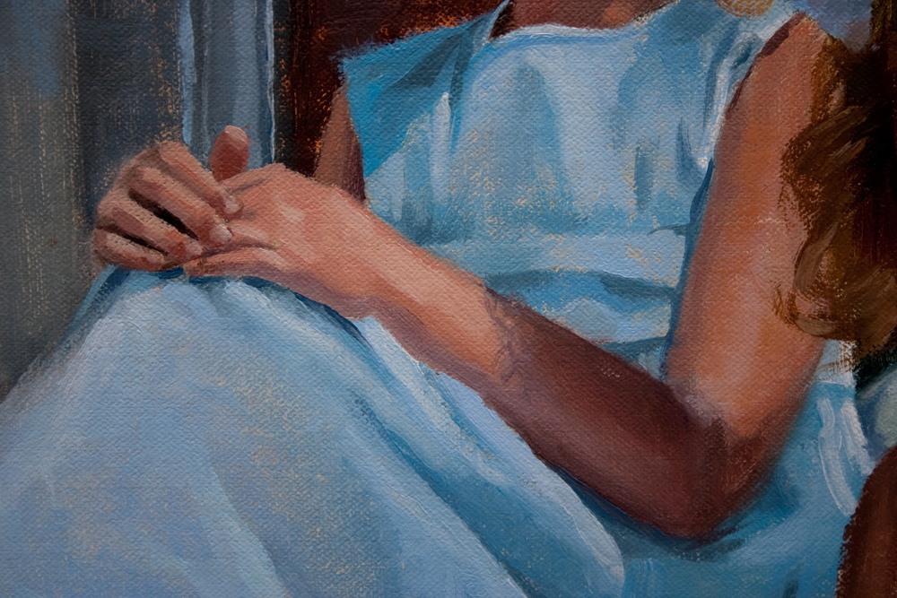
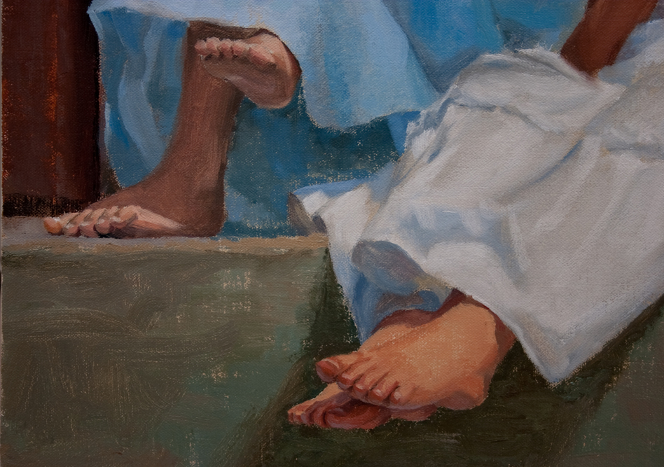
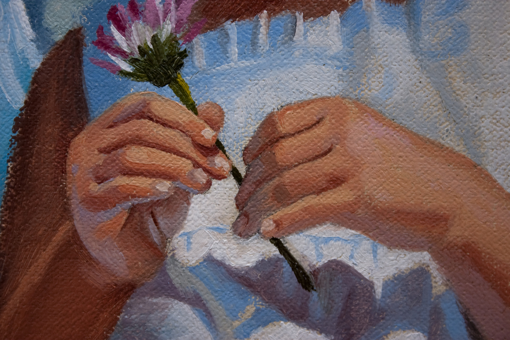
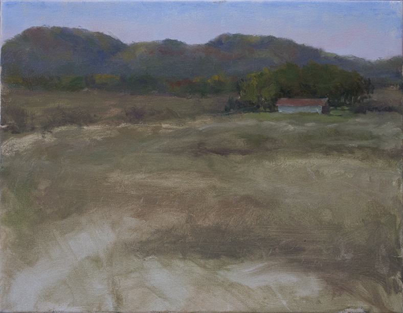
After establishing a solid drawing, I move into the painting. A common pitfall at this stage is to get too attached to the preliminary drawing. The best thing you can do when painting on top of a drawing is to paint over it. Being too careful to preserve the under-drawing amounts to a sort of color-in-the-lines, paint-by-number approach. It leads to stale edges, and plastic brushwork. My painting teacher, Brian Jekel, used to say "you found the drawing once, you can find it again." It's important to maintain a fresh painting approach, especially here, so don't be afraid to cover up the drawing. When painting from photographs, it can be difficult to maintain a spontaneous, alla prima technique. The best remedy for this is to paint from life as much as possible. So in the example below, I made sure to paint well into the edges, covering up much of the original drawing. I've also toned my canvas a warm sienna/yellow ochre/ultramarine blue wash.


To sum up this post, here are some excellent thoughts from other great artists on drawing practices (or lack thereof)...
A practice that can directly effect our compositions is tracing projections. No other issue in the field of painting stimulates as much passion, anger, finger-pointing and self-justification as that of tracing a projected image before painting it.
We hear arguments that tracing is just one of the many tools available to us, that it saves time and energy, that the grand masters of the past used similar available methods, that many artists trace but won't admit it--all these in favor of projections. Those against such tracings argue it's not honest, it's deceiving the viewer by representing skills the artist does not own, that it's not professional.
I offer you a different reason why tracing projections is a bad idea: it locks you in to a composition far too early. Even if the photo being traced is composed well, an artist depending upon the tracing fails to discover composing opportunities that might be inherent in the photo but are not obvious at first glance.
My own experience has taught me that drawing enables me to seek out and discover surprises which can greatly contribute to the quality of my painting. Sometimes these come when, while drawing, I realize that if I shift a shape or alter it slightly, I can give the work an additional strength or change the total nuance of the scene. But most often, the drawing allows me to give the painting a visual coherence by helping me relate more intimately with the subject before committing it to paint
From my own viewpoint, working through the drawing gets my adrenaline going, makes me excited about the subject's potential. Who cares about saving time for the painting when the time spent with the drawing can give such richness to the experience. And why sacrifice an unknown discovery for the sake of accuracy of shapes?
No, I am no fan of tracing. It's not that I'm passing judgment or being an elitist. Rather, it's because I know that the artist doesn't know what she/he doesn't know. What good is it just to make another picture if, as artist, I fail to take every opportunity to make that picture my own voice.
-artist Dianne Mize
...Very well said!!! And here, Richard Schmid explains why drawing is the most important part of a painting.
Because none of those other things matter if they are in the wrong place, or are the wrong size or shape—even if they are correct in themselves. That’s what drawing is—getting your colors and values the right size and shape, and putting them in the right places! As for edges, I consider them to be as important as drawing since it is not possible to connect your shapes convincingly without at the same time creating appropriate edges. I have long understood that drawing and edges are inseparable.
-artist Richard Schmid
*see part 3 here*


